Guides
learning hub
MY ROLE | Lead UX/UI Designer & Project Manager
COMPANY | Pip Decks® are confidence-boosting business toolkits
WORKED WITH | CEO, Engineer, Publishing Team
DURATION | 1 year
TOOLS | Wordpress, Miro, Hotjar, Notion, Google Meet

OVERVIEW
Pip Decks sells confidence-boosting educational card decks to help professionals lead workshops and solve creative challenges. While users loved the physical product, they often struggled to fully understand how to apply it in real-world situations. The lack of practical context created friction—especially for new users—reducing confidence and limiting repeat engagement.
To solve this, I led the design and delivery of Guides: a digital learning hub that paired tactics with real-life use cases, expert tips, and visual walkthroughs. My goal was to bridge the gap between knowing the tools and understanding how to confidently using them.
Despite high-quality content, many users hesitated to apply tactics without seeing them in action. We needed a way to showcase real-life applications and support deeper learning without overwhelming the user.
THE PROBLEM
“The cards are great—but I’m not always sure when or how to use them in real life.”
Create a scalable, user-friendly learning platform that contextualizes Pip Decks tactics through practical examples, while staying on brand and enhancing user confidence.
THE GOAL

PROCESS
DISCOVERY & RESEARCH
I initially began building the Guides platform and content based on internal assumptions and early product goals. However, I quickly realized the importance of grounding the experience directly in customer needs. To bring users into the journey early, I conducted over 50 customer calls focused on live user testing and pain point discovery. I mapped users' journeys and synthesized feedback into thematic insight clusters.
I transformed these insights into journey maps and customer personas, and shared them company-wide through a visual set of customer insight cards to inform future product, content, marketing and design decisions.


Note: Images intentionally blurred to respect internal company confidentiality.
CONTENT STRATEGY & STRUCTURE
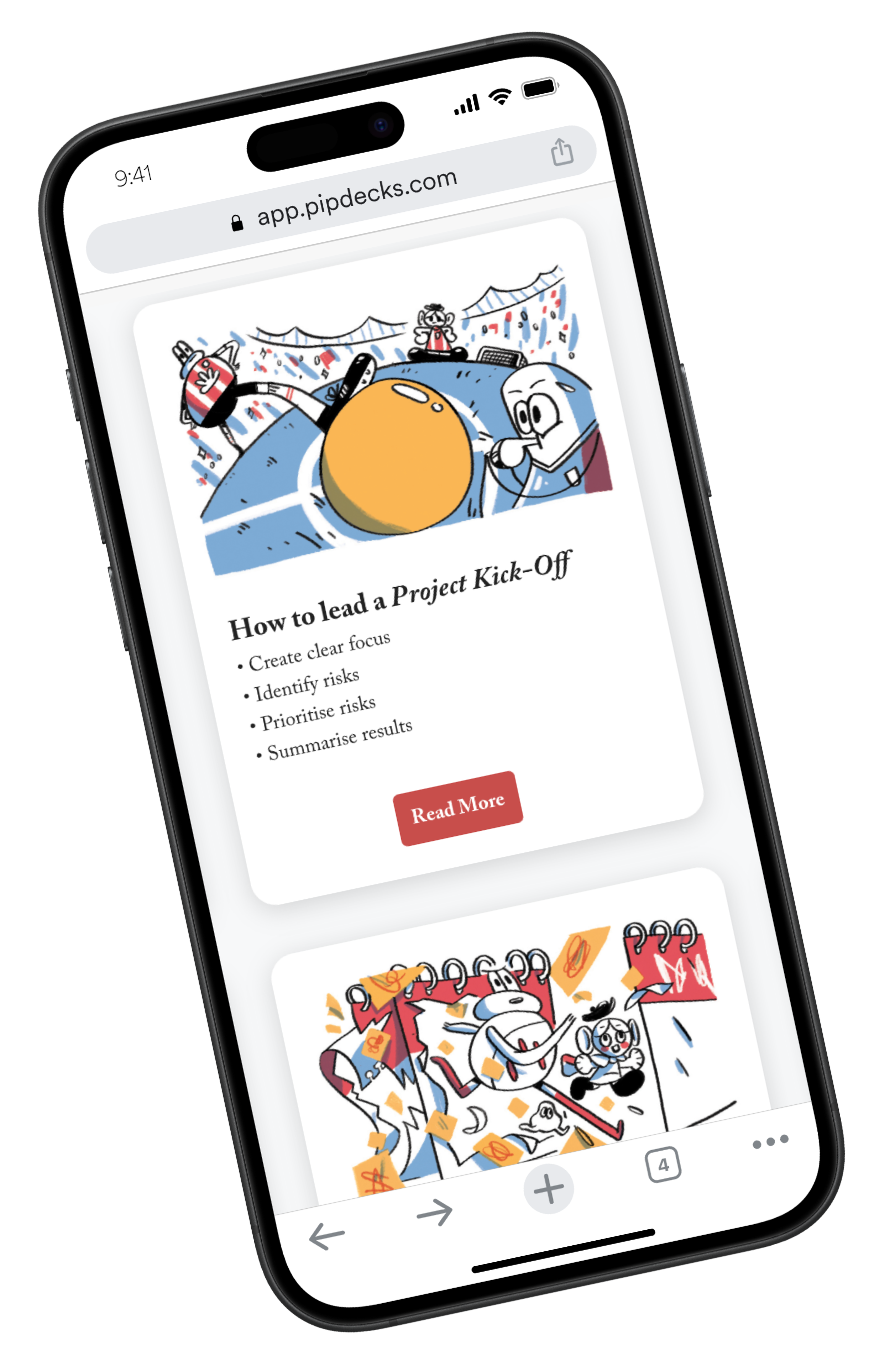
Using a modular approach, I designed a scalable content system that balanced depth with clarity. Each Guide featured a clear structure, including when to use the three sequential tactics, a step-by-step walkthrough, expert tips, relevant card links, and visual worked examples. To support intuitive navigation, Guides were grouped thematically based on the card deck they came from. I collaborated closely with the content team to align each Guide with brand tone and editorial standards, ensuring consistency across the platform.

I built the Guides website from scratch using WordPress, and project-managed freelance developers to bring the custom homepage and UX concepts to life. I wireframed low- and mid-fidelity layouts in Figma, prioritizing quick wins for new users (Beginner Guides), deeper dives for experienced users (Sequencing Guides), and interactive card linking to bridge physical and digital experiences. After iterative feedback sessions, I created annotated, developer-ready UI mockups detailing content hierarchy, interactions, and mobile responsiveness.
UX & DESIGN
Working closely with the CEO and developer, I owned the delivery timeline—tracking tasks in Notion and running weekly check-ins to align on blockers, dependencies, and QA. I also collaborated with the content team on layout and formatting for each Guide entry, ensuring that content quality and design consistency remained high throughout development.
PROJECT MANAGEMENT
OUTCOME
User satisfaction increased by 20%, based on survey feedback.
Product sales rose by 10% in the month following launch.
Guides quickly became one of the top three visited sections of the website.
REAL-WORLD CONSTRAINTS
As the primary designer responsible for both the platform and content structure, I managed most aspects of Guides with limited internal support. Without a dedicated engineering or research team, I had to balance user research, UX/UI design, and content collaboration while staying aligned with Pip Decks’ brand standards. Tight timelines and evolving ideas from early customer feedback made it essential to prioritize a focused MVP and deliver a scalable system quickly.
WHAT I LEARNED
One of the biggest lessons from Guides was the power of involving users early and often. Starting with internal assumptions gave us a foundation, but it was only through customer interviews and live testing that the real needs and opportunities emerged. Building alongside users, not just for them, made the product stronger and more aligned with actual pain points. I also learned that consistency beats complexity when designing scalable learning platforms. A clear, repeatable content structure made Guides easier for users to navigate and for the team to maintain and expand. Finally, working closely with the content team reinforced how crucial collaboration is in preserving brand voice while still making space for user-centered innovation. Good structure, clear communication, and shared ownership were key to building a system that could grow beyond the first launch.
IF I HAD MORE TIME
I would expand the experience with features that deepen engagement and meet users in context. This could include:
Searchable flows based on user goals (e.g., “Run a discovery session”)
Progress tracking to help users follow structured learning paths
Community-sourced examples that show real-world use across industries and expanding it to something like “Miroverse”