Tactic Finder
web-app feature
MY ROLE | Lead Product Designer
COMPANY | Pip Decks® are confidence-boosting business toolkits
WORKED WITH | Cross-functional team of 8
DURATION | 2 months
TOOLS | Figma, Miro, Hotjar, Notion, Google Meet

OVERVIEW
As Pip Decks’ library of creative toolkits grew, so did a common user complaint: “There’s so much here—I don’t know where to start.” Despite a high-quality product, users often felt overwhelmed and unsure how to navigate to the most relevant content. This friction was especially strong during onboarding, where users needed early wins to feel confident.
I led the end-to-end design of Tactic Finder, a new discovery experience that guides users to the most relevant tactics for their needs. Working closely with product, engineering, content, and deck authors, we built a mobile-first feature that simplified choice, reduced onboarding drop-off, and helped people feel empowered from their very first interaction.

Users loved our content, but navigating the large library was overwhelming. They often resorted to manually skimming cards or leaving the platform altogether. This friction was especially problematic due to majority of users have “no time”.
THE PROBLEM
“I love the product, but I am just shuffling through the decks—there are so many great ideas, but I’m not sure where to start.”
Design a feature that helps users quickly discover the most relevant tactic—without requiring deep familiarity with the full deck or complex navigation. The solution needed to be intuitive, scalable, and align with Pip Decks’ tone of voice: confident and inspiring.
THE GOAL
PROCESS
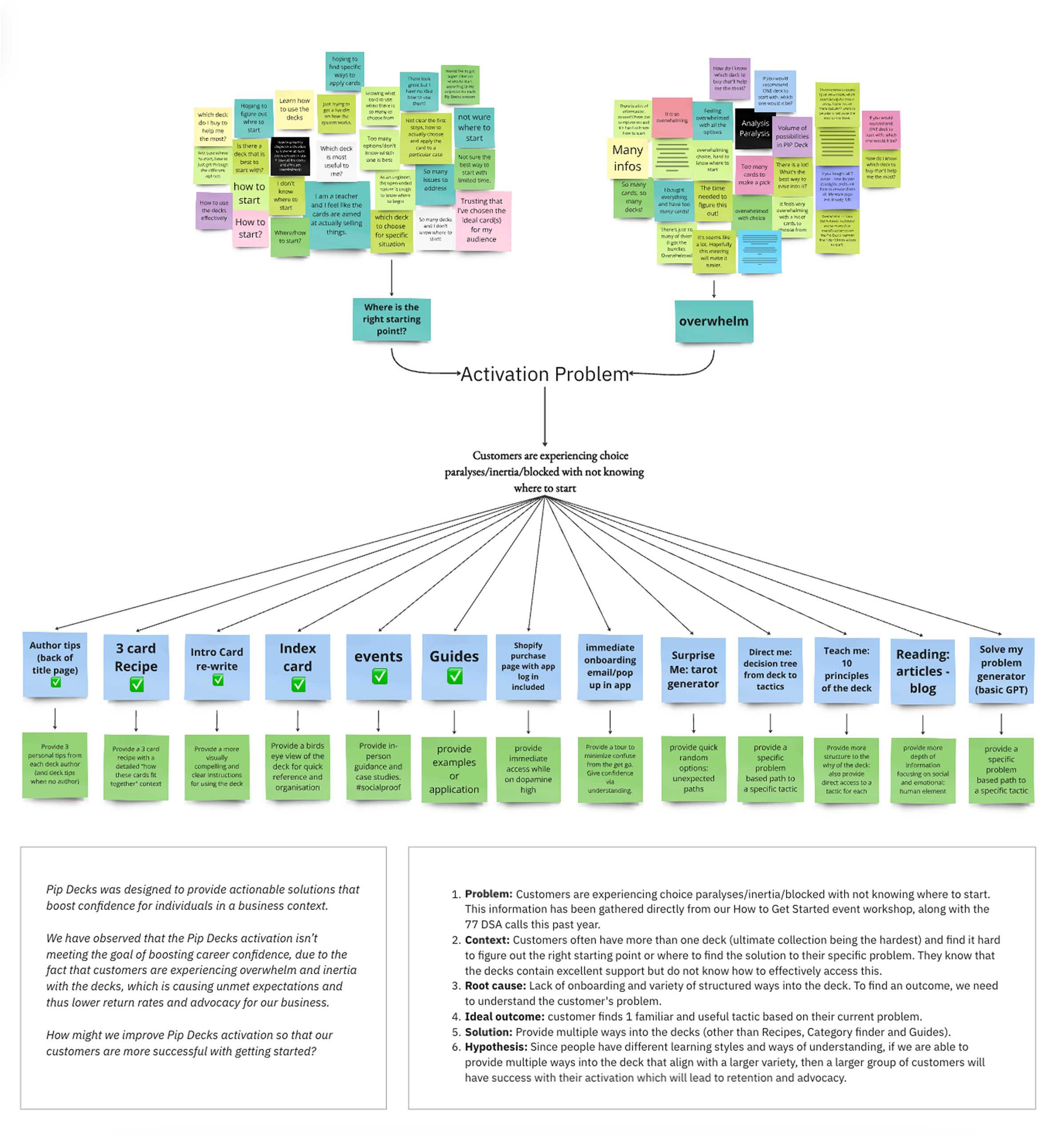
I conducted 30+ user interviews and analyzed customer support tickets to understand pain points. I also used the insights from a “How to Get Started” event I lead with 100 participants. Key insights:
Users wanted "shortcut" access to the right tactic based on their task.
Some users didn’t even know which deck to start with, experiencing choice paralysis.
Time pressure was a recurring theme.
DISCOVERY & RESEARCH

Note: Image intentionally blurred to respect internal company confidentiality.
Using affinity mapping and breaking down the anatomy of the insights, I surfaced key opportunity areas. Together with the Head of Design, I presented several different solutions I had brainstormed based on these insights, and we collaboratively narrowed it down to a quiz-style guided search.
IDEATION


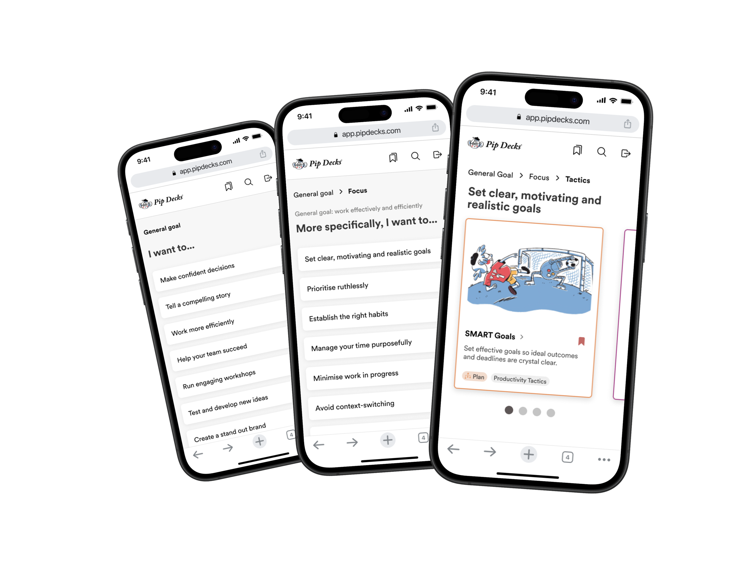
I built mid-fidelity prototypes that asked the user a few simple questions about their challenge. I iterated rapidly through 3 user testing rounds, refining tone, question framing, and UI clarity.
PROTOTYPING
Final high-fidelity designs included a dynamic results page, smooth transitions, and design system components to maintain consistency. I collaborated with engineering to ensure accessibility and performance standards.
UI DESIGN & DEV HANDOFF
OUTCOME
20% increase in onboarding success for users.
Average time to tactic reduced by 35%.
Users called it a “confidence-boosting” experience.
REAL-WORLD CONSTRAINTS
We were a small team with limited resources — just one engineer and two designers — and a tight delivery timeline. That meant we had to move fast, prioritize ruthlessly, and focus on shipping a simple, high-impact MVP.
To avoid blocking development while still ensuring content quality, I coordinated asynchronously with five authors and the content team to map tactics to user pain points. I made the final content decisions across all eight Pip Decks and personally wrote the full content flow for one of the decks.
Since we didn’t have time to build advanced filtering or personalization, I added a simple “Can’t find what I want?” button. This gave users a voice, helped us identify content gaps, and created a feedback loop — all with minimal engineering lift.
WHAT I LEARNED
Bias awareness is key when designing decision-based flows—especially when users may be stressed or under time pressure.
Collaboration is everything — daily design-engineering check-ins during build minimized friction and increased velocity.
Early prototyping and testing sharpened user flow clarity and cut assumptions.
To take Tactic Finder further, I’d expand personalization — making it feel smarter and more adaptive over time. Ideas include:
Lightweight AI to tailor recommendations based on user behavior
A feedback loop so users can rate results and help improve future matches
Onboarding integration to show value from day one
Cross-deck tactic bundles to surface bigger-picture solutions
These would strengthen engagement, deepen retention, and evolve Tactic Finder into more of a strategic companion than a one-time tool.
IF I HAD MORE TIME