Shop Decks
web-app feature
MY ROLE | Lead Product Designer
COMPANY | Pip Decks® are confidence-boosting business toolkits
WORKED WITH | Engineer & CEO
DURATION | 2 weeks
TOOLS | Figma, Miro, Hotjar, Notion, Google Meet
OVERVIEW
Pip Decks offers library of educational card decks to help professionals lead with confidence — but there was no way to browse or buy more decks within the web app. Users had to exit to a separate e-commerce site, creating friction and confusion about ownership and options.
I led the design of Shop Decks, a feature that streamlined this flow. While in-app purchasing wasn’t possible (due to development constraints), we created an intuitive in-app browsing experience with personalized buy options, ownership tracking, and direct web checkout links with discounts.

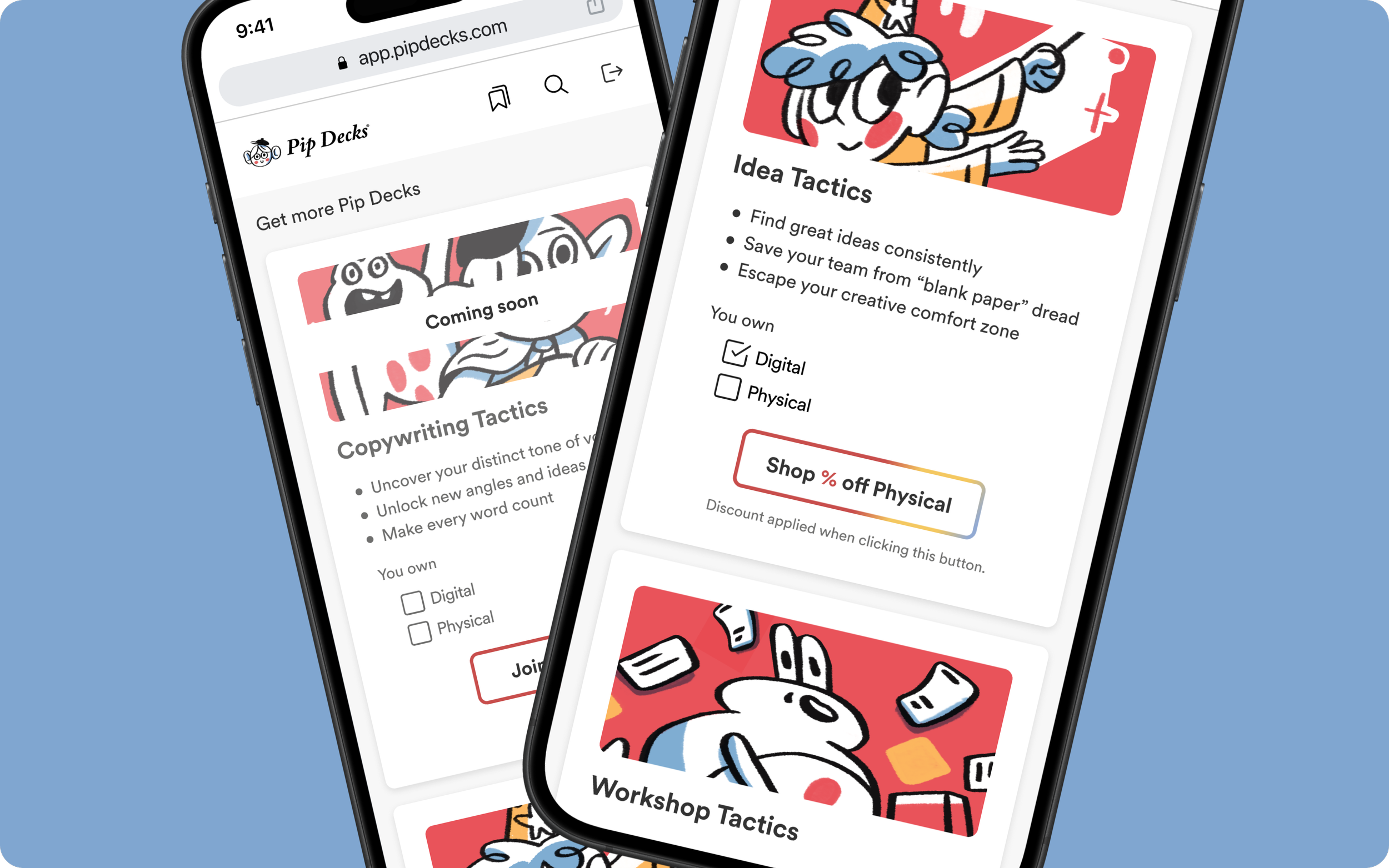
Inside the Pip Decks Digital app, users had no easy way to browse available decks, check what they already owned, or explore new options without exiting to the external website.
THE PROBLEM
"I just want to quickly see what else is available — without bouncing between the app and the website."
We aimed to build an intuitive, integrated flow that would make deck discovery easier, reinforce ownership clarity, surface relevant discounts, and reduce purchase friction by linking directly to the right checkout page.
THE GOAL
PROCESS
With tight timelines, the discovery and research phase relied on insights from over 30 past customer calls that were web app specific, and input from the marketing team. Many users took pride in collecting Pip Decks and wanted a clear, satisfying way to view which decks they owned. Switching to the website disrupted that experience, and users valued the ability to preview and explore new decks within the app. Discounts were a strong motivator, especially when users already owned a digital or physical version. These insights helped prioritize three core needs: ownership clarity, purchase guidance, and minimizing friction in the in-app browsing experience.
DISCOVERY & RESEARCH

Note: Image intentionally blurred to respect internal company confidentiality.
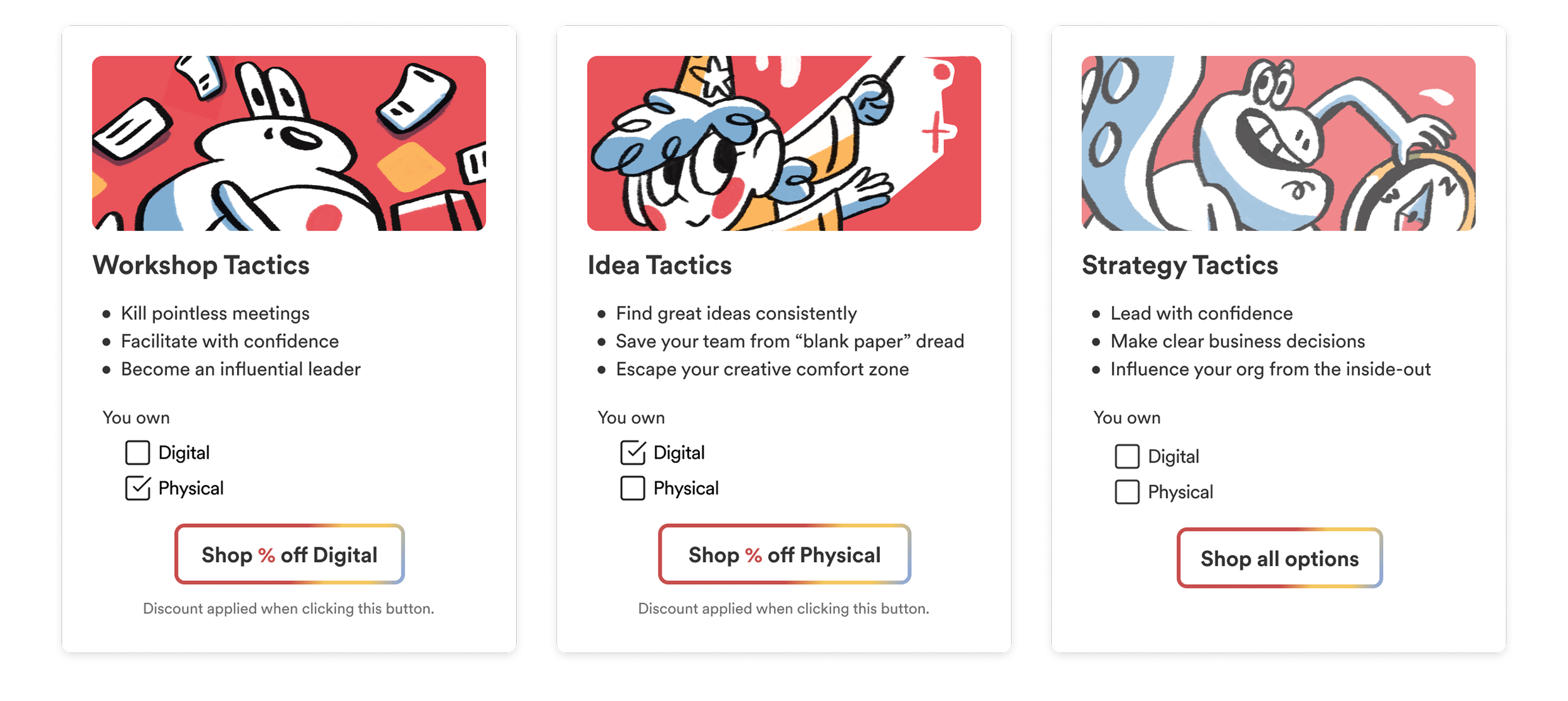
I mapped out user journeys and identified key friction points in Miro. From there, I ideated and wireframed a collection page grouped by ownership status. Each card adapted dynamically — showing ownership checkboxes, preview buttons, and conditional “Shop” buttons with tailored discounts. I also included “Get more Pip Decks” prompts throughout the app to surface buying opportunities at key decision points. Users also had the opportunity to preview parts of decks not owned yet.
IDEATION
Using Figma, I built mid- and high-fidelity prototypes that demonstrated how the logic would adapt the UI based on user data. The prototype showed different states for users who owned nothing, one format, or both formats. Preview modals provided clear value propositions and supported confident decision-making.
PROTOTYPING

UI DESIGN & DEV HANDOFF
I created polished mockups aligned with Pip Decks’ design system and worked closely with engineering to define development-ready specs. Layouts were annotated with interaction logic, accessibility notes and content variations to ensure smooth handoff despite our limited dev capacity.
OUTCOME
Although the feature wasn’t shipped due to budget cuts, I completed the full design process and reached a build-ready state aligned with the engineer. Users would have been able to view their collection, preview decks not owned yet, see ownership status in their deck library, and access tailored purchasing options with just a click — all in a streamlined, user-centered flow.

We had just one engineer and the CEO supporting design. Development was paused across the company shortly after handoff. Without capacity for native in-app purchases, we focused on creating web redirects. I prioritized a lightweight MVP that delivered value quickly, embedding smart shop prompts across the app and designing a scalable content logic system to dynamically update based on user status.
REAL-WORLD CONSTRAINTS
Even with limited engineering capacity and a short timeline, it’s possible to design systems that guide users toward confident decisions. Clear logic, consistent UI, and contextual prompts go a long way in building trust. I also learned the value of building a fully dynamic, logic-based content system early on — so the solution could scale, even if the budget couldn’t. Working closely with both engineering and the CEO also reinforced how important it is to stay aligned on technical scope from day one.
WHAT I LEARNED

To take Shop for Decks further, I’d explore ways to make discovery even smarter and more tailored. This could include:
Deck bundles and suggestions based on user behavior
Personalized recommendations tied to what’s in a user’s current collection
Full in-app purchasing options for a frictionless experience
These updates would elevate the experience from a simple browsing tool to a strategic discovery companion.
IF I HAD MORE TIME